|
Likely in the Summer
of 1928, J R R Tolkien began his popular literary career by writing
the first line of the Hobbit: "In a hole in the ground, there
lived a Hobbit". He was grading essays and one student had
mercifully left a blank examination page. This prompted him to start
writing. He set this page aside and did not write more about Hobbits
until some period later. Unfortunately, the famous examination page
was lost. I can only imagine its collectible value today.
 |
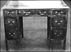
| Tolkiien wrote,
typed and illustrated the Hobbit at this desk. It was donated
to a charity as part of a fund-raising activity. It now resides
at the Marion Wade Center. |
Tolkien worked on The
Hobbit intermitently from this point up to its publication in 1937.
He read parts of the story to his children all through this period.
C. S. Lewis read a draft in 1933. One of Tolkien's former students,
Elaine Griffiths, convinced a friend, Susan Dagnall, who worked
for the publishing house of Allen and Unwin, to consider the book
for publication. As a result of this interest, Tolkien polished
the book and finished the ending.
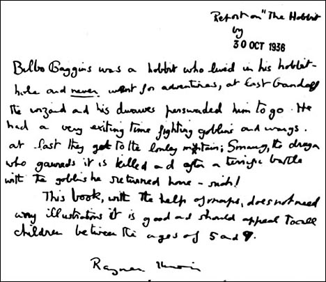
The Hobbit was reviewed
by 10-year-old Rayner Unwin, the son of Stanley Unwin. He was asked
to review this book because it was considered a book for his age
group. He was paid the standard fee of one shilling. As he later
said, "It was the best shilling the firm ever spent".

Although a publishing
contract was executed in 1936, there was still considerable work
done on the book before it was finally published. In particular,
Tolkien tried his hand at illiustrations and designed a marvellous
dustjacket. Unfortunately, his first design had too many colors
and was revised.
The American publisher,
Houghton-Mifflin, was also preparing for publication. They requested
illustrations and Allen and Unwin suggested that Tolkien attempt
them. He produced five wonderful color illustrations. Houghton-Mifflin
kept four and paid Tolkien $100 for each one.
The Hobbit was finally
published on September 21, 1937.It was immediately popular and the
first printing sold out by Christmas. The American edition was published
March 1, 1938. By June, approximately 3,000 copies were sold. Although
the Hobbit was a popular childrens book from the time of its original
publication, it was not until the explosion of interest in The Lord
of the Rings, during the 1960s that sales shot up into the millions.
 |
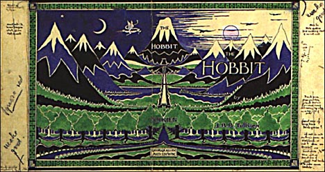
| The original dustjacket
design for the Hobbit. William Morris was a strong influence
on Tolkien's designs. As with many aspects of his creative work,
he was able to take elements from other sources and blend them
into his own style. The William Morris element here is reflected
in the border design and the repetitive symmetry of the trees
and mountains. However, this influence is understated and the
general design is still Tolkienesque. |
The First Printing
of the First Edition
Published September 21,
1937, 1,500 copies.
The first printing of
the Allen & Unwin UK edition of the Hobbit prominently includes
the dustjacket designed by Tolkien. It was done in a wraparound
style in black, green and blue. It is certainly one of Tolkien's
best illustrations and demonstrates his innate sense of visual design.
It is unlikely that a professional illustrator would have done better.
It has become one of the most recognized book covers of all time.
The first printing also included 11 black-and-white illustrations
and two maps, printed in red and black. The book was constructed
of green cloth boards and contained 312 pages. It was 19 x 13.5
cm (7.48 x 5.31in). These boards were impressed with Tolkien's left-facing
dragon and a delightful mountain scene along the top. The spine
inlcudes, The Hobbit by JRR Tolkien. The center of the binding has
a design made from the runes Th, D, Th. The bottom of the spine
includes the publisher's name, George Allen & Unwin, Ltd. Page
6 states, "FIRST PUBLISHED IN 1937. The first printing includes
no color illustrations. These were included in subsequent impressions.
Here is a list of errors cited by Hammond. It is unclear when all
of these were corrected:
1. p14, ll. 17-18, 'find
morning', for 'fine morning'.
2. p17, ll. 29-30, "So you have got here at last! what (for
That) was what he was going to say'.
3. p25, l. 11, 'more fierce then fire' for 'more fierce than fire'.
4. p62, ll. 2-3, 'uncomfortable palpitating' for 'uncomfortable,
palpitating'
5. p62, l. 31, 'their bruises their tempers and their hopes' for
'their bruises, their tempers and their hopes'.
6. p64, l. 21, 'where the thrush knocks' for 'when the thrush knocks'.
7. p85, l. 10,
'far under under the mountains' for 'far under the mountains'.
8. p104, l. 17, 'back tops' for 'black tops'.
9. p147, l. 16, 'nor what you call' for 'not what you call'.
10. p183, l. 26, reversed double quotation marks for the word 'Very'.
11. p205, l. 32, 'dwarves good feeling' for 'dwarves' godd feeling'.
12. p210, l. 29, 'above stream' for 'above the stream'.
13. p215, l. 13, 'door step' for 'doorstep'.
14. p216, l. 4, 'leas' for 'least'
15. p229, ll. 16-17, 'you imagination' for 'your imagination'.
16. p248, l. 32, 'nay breakfast' for 'any breakfast'.
Here is a list of the
illustrations:
P4: The Hill: Hobbiton
Across the Water
P49: The Trolls
P68: The Mountain-path
P117: The Misty Mountains Looking West from the Eyrie Towards Goblin
Gate
P126: Beorn's Hall
P146: Mirkwood (halftone plate facing page 146)
P177: The Elvenking's Gate
P196: Lake Town
P209: The Front Gate
P307: The Hall at Bag End
front endsheet: Thror's Map. printed in black and red
back endsheet: Wilderland, printed in black and red
The Second Impression
By December 15, the first
printing was sold out and a second impression was quickly prepared.
It originally consisted of 2,300 copies. This edition was marked "Second Impression 1937", although it was actually published
in January 1938. During the bombing of London in 1940, 423 unbound
copies were destroyed by a fire at the bindery of Key & Whiting.
The line drawing of the Hill: Hobbiton Across the Water (p4) was
replaced by a color frontispiece of The Hill: Hobbiton Across the
Water. Three other color plates were added: The Fair Valley of Rivendell
facing page 59, Bilbo Comes to the Huts of the Raft Elves, facing
page 192, and Conversation with Smaug, facing page 228.
|
The Third Impression
In late 1942, Allen & Unwin printed 1,500 copies of a third impression under
their imprint and 3,000 copies for the childrens book club
sold by the bookseller Foyles. The third impression is dated
1942. The third impression printings were supplied to Foyles
unbound. They were bound independently, without maps, in yellow,
gilt-stamped cloth over boards. The dustjacket was black,
orange and white, featuring a drawing of a dandified Hobbit.
Needless to say, Tolkien and anyone familiar with the story
detested this depiction of Bilbo.
|
 |
Presumably as a result
of war-time shortages, Allen & Unwin designed an inexpensive
version of the third impression. This version omitted all of the
color plates except the color frontispiece of The Hill: Hobbiton
Across the Water. Three corrections were made in the text:
p 183, the double quotation
marks were reversed.
p 216, 'leas' changed
to 'least'.
p 229, 'you imagination' changed to 'your imagination'.
The Fourth Impression
The fourth printing consisted
of 4,000 copies dated 1946 but not officially published until November
18, 1947. Corrections in this impression included:
p 14 'find morning' changed
to 'fine morning'.
p 85 'far under under the mountains' changed to ' far under the
mountains'
The First American
Edition
First Impression, or
state one of the first impression, publication in 1938, specific
date unknown.
Second Impression, or
state two of the first impression, published March 1, 1938, 5,000
copies.
The first American edition
of the Hobbit was published by Houghton-Mifflin in 1938. It differed
significantly from the UK edition by the inclusion of four of Tolkien's
color plates. Two of these were used for the dustjacket, The Hill:
Hobbiton Across the Water (front) and Conversation with Smaug. Houghton-Mifflin
also decided to place a small figure of a bowing hobbit on the title
page and the cover. Unfortunately, this hobbit wore boots! To be
fair to the publisher, this hobbit was modeled on the hobbit figure
in Tolkien's illustration, Conversation with Smaug. The hobbit in
the illustration also wears boots. This figure was removed at some
point in production, probably as part of the second impression.
However, the American edition with the bowing hobbit is also referred
to as the first state of the first impression. The number of copies
of the first state is currently unknown. |
|
The second state of the
first impression is characterized by the replacement of the bowing
hobbit with the Houghton-Mifflin device of a seated flute player.
Houghton-Mifflin proposed
that the American edition include color illustrations by a professional
artist. Allen & Unwin suggested that Tolkien produce them. Since
Tolkien had already produced the Allen & Unwin dustjacket and
line drawings, they obviously appreciated his skill and the general
need to have ll the illustrations in a similar style. Tolkien was
concerned that his work was not of professional quality and would
not compare to a professional artist. Nevertheless, he made a great
effort and produced five paintings that became hallmarks of his
personal vision of Middle Earth.
These were, The Hill:
Hobbiton Across the Water, Rivendell, Bilbo Woke Up with the Early
Sun In His Eyes, Bilbo Comes to the Huts of the Raft Elves and Conversation
with Smaug. All except Hill were made in mid-July, 1937. Four of
the paintings were used in the first American edition. A slightly
different set of four was used in the second impression of the UK
edition. The original paintings are now in the collection of the
Bodleian Library in Oxford. Bilbo Comes to the Huts of the Raft
Elves was produced in poster form by the library. The Bodleian would
do a great service for collectors and other fans by publishing a
poster series based on the illustrations.
Second Edition of
the Hobbit
The second edition of
the UK Hobbit was published in 1951 (3,500 copies). It is also referred
to as the fifth impression. Page 8 is marked First Published in
1937, Second Impression 1937, Reprinted 1942, Reprinted 1946, Second
Edition (Fifth Impression) 1951. The front of the dustjacket is
marked "Fifth Impression". The dustjacket also includes
press statements from The New Statesman and Nation, Observer, London
Times and Lady. The text also has some corrections of the fourth
impression but a number of errors remained
As Tolkien was writing
the Hobbit sequel, The Lord of the Rings, he became aware of inconsistencies
between the characterization of Gollum in the Hobbit and the features
of desperation and obsession with the Ring that were required as
motivation for his behavior in The Lord of the Rings. The original
Gollum was less crazed and degraded by his long association with
the Ring. As a result, Tolkien substantially revised Chapter 5.
These are described in detail in the Annotated Hobbit.
The first of these revisions
were made in 1947 and incorporated into the new edition of 1951.
The second American edition of 1951 was constructed by binding 1,000
copies printed in the UK by Allen & Unwin. The foot of the spines
are marked Houghton-Mifflin Company.
|